Monday, June 11, 2012

More Rule of Threes


It’s actually a bit hard to separate depth of field issues from the so-called “rule” of threes or of third. The concepts are closely intertwined and all work together to create very elegant photos. These two, taken last month in Colorado of our youngest granddaughter, display this concept nicely. In the top picture, notice the image is divided into thirds – rather than centering Elena, I placed her in the left third of the picture. With the background out of focus (using a long telephoto lens) the expression on her face and her body languages really snap out at the viewer.

In the second photo, which is really a lucky shot as I was walking ahead of her and only happened to glance over my shoulder to see what she was up to, I place her once again to the left. Notice there are only three “objects” in the picture – the wheel, her face, and the background.

In the bottom picture, of Addy, Elena’s older sister, notice the off balance approach and the out of focus, mostly uncluttered background. All of these elements take thinking ahead, with these “rules” in mind.

Sunday, March 25, 2012

More Rainy Day Photography


In that it rains a lot in the mountains where we live, I figure I might as well enjoy rainy day photography. Pictured here is our visit this week to the Biltmore Gardens (twice this month!). Note that the rainy day means no harsh shadows and natural saturation to the color. I shot these with as low an ISO as I felt I could hand hold (100 and 200) and carefully framed each shot (while my wife held the umbrella!).

Note too that three of these are taken with my telephoto zoom, to get as much of the background out of focus as possible, thus creating a feeling of three-dimensions. Also notice the deliberate framing and that they are taken for the most part below eye-level (take more glucosamine and bend your knees!).

Each image is shot in camera raw and then opened in Adobe Bridge, where I increased the blacks and the saturation. I also increased the “temperature” to “warm” them up a bit on an otherwise fairly chilly and gloomy day.

Saturday, March 03, 2012

Enhancing Your Photos


As I said in this week’s podcasts about Photoshop, I consider enhancing your photos as basic a task to good photography as taking off the lens cap before shooting. With the simple and easy tools now available for free, not to mention the dirt cheap copy of Photoshop you can get at the bookstore, there is really little excuse not to always present your very best efforts.

The above photos were taken in the greenhouses at the Biltmore Estates in Asheville this week. I’ve presented both the “before” and “after” versions to show you what I did in Adobe Bridge, which is companion software that comes in the Photoshop suite. Shooting in “camera raw,” I’ve adjusted the blacks, fill light, exposure and vibrance on each of these pictures, adding what I consider to be a considerable amount of “life” to otherwise well composed, but relatively drab pictures.

Be sure also to note the depth of field on these – I kept it “shallow” to highlight the texture of the flowers, by shooting at as low an ISO as I could (125) and still get vibration free pictures. A low ISO provides pictures with a lot of clarity (low “noise” level) but it also tends to lower the shutter speed too, which can cause difficulties with moving objects or holding the camera steady.

Saturday, January 21, 2012

Applying Trigonometry to Composition!


The weather was sunny and balmy here in North Carolina earlier this week, so I decided to go out and try to illustrate some basic lessons in composition.  Although there are no hard and fast “rules” in photography, and although it is completely possible to be self taught, there are some universal esthetic principles that date back to the Greeks (look at pictures of the Parthenon, for example) and which were first put to extensive print analysis in Luca Pacioli's Divina Proportione in 1509.
Usually known as the Golden Rectangle, a mathematical theory was developed by the Greeks and explored more scientifically by Pacioli which has been followed by artists ever since. Distilling this theory to esthetic principles is known as the Rule of Three or Thirds in photography. Essentially the goal is to divide your frame into third, not halves or fourths. The thought here is that thirds give a picture some dynamic tension, whereas halves or fourths are so centered they tend to make the picture feel “at rest.”
In any even the goal of thinking about this “rule” as you take pictures is as much about getting you to actually “think” about your composition as it is to get you to follow any “rule.” In other words, position your primary objects carefully ,and above all, avoid clutter! Think about “three” – no more than three major objects or groups of objects in a picture (often including sky and other blank space). And above all, don’t center your central object – have it slightly off center to create the feeling of dynamic tension I talked about above.
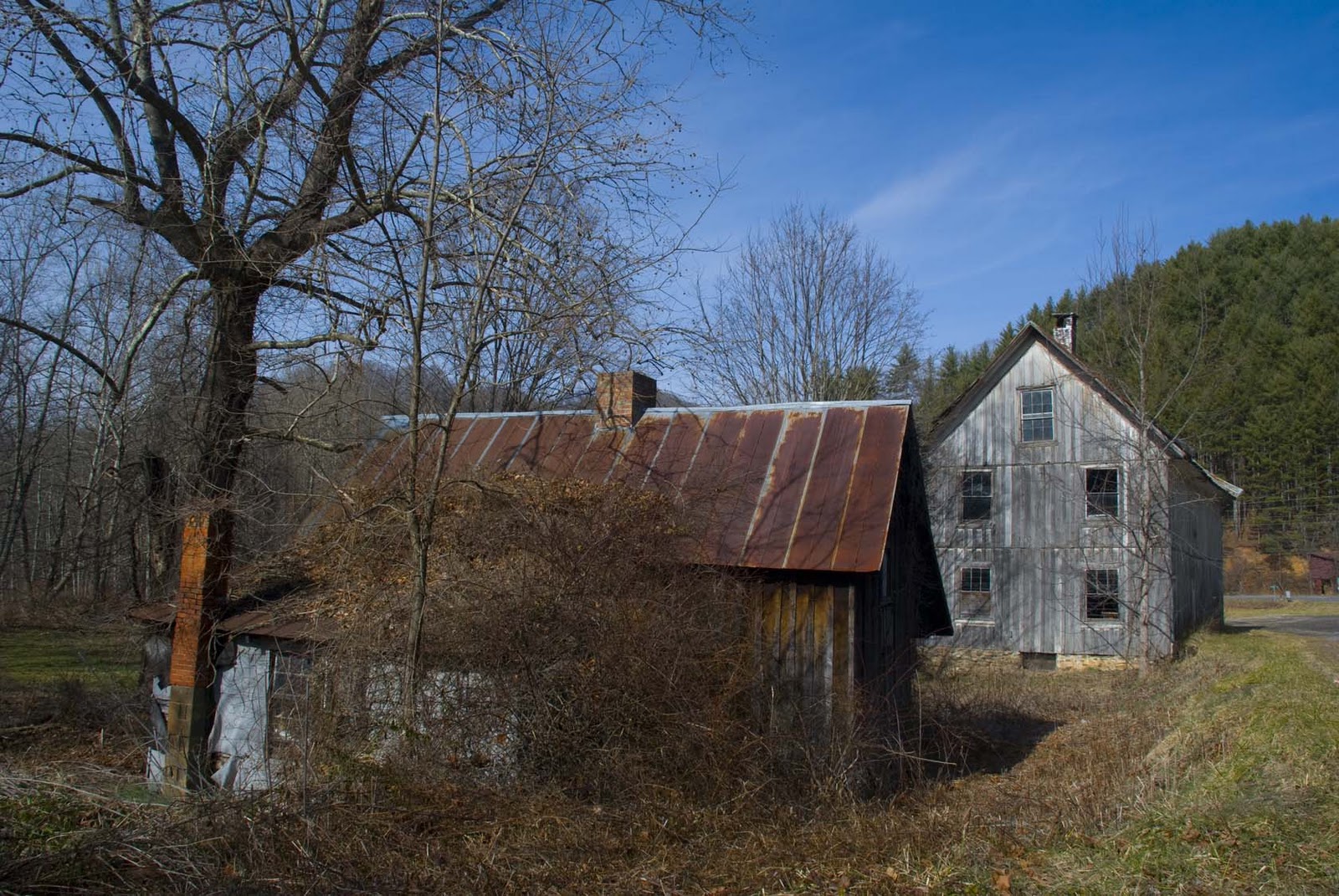
With that in mind, I explored an old country store and related outbuilding – carefully setting up each shot, always knowing exactly what was in my frame and where each object was. How do you think I did?oHow do you think I did?

Wednesday, January 18, 2012

Revisiting Depth of Field


I can never say enough of Depth of Field and how important understanding and manipulating it is for your pictures. As stated in other places, the key is to create a “shallow” depth of field, with just that area of the picture you want in focus and the rest out of focus. This creates a dramatic impact on your central image in the photograph.

To accomplish this, you need a “long” (telephoto) lens – zoom your digital camera out (T) to the max. You also need a fast as possible shutter speed, because this forces the lens aperture to open (see lectures on Aperture). Finally it helps to get as close as possible to your central subject.

All of the photos above were taken this past summer with a Nikon D80, using a 135mm lens. In the top picture, of our grandkids, notice that the dark background is completely out of focus, thus providing no distraction from the central subject. The next two pictures, from a local rodeo, were a little trickier – there wasa lot of motion going on and it was late evening. But the effect I was looking for, of motion, worked out pretty well, with the background completely out of focus  and a bit of blur to the central objects to show they are moving.

The two flower pictures are from our neighbors garden – notice the sparkly effect, called bokeh, to the background, as well as the early morning lighting.

If you have a point and shoot without all the bells and whistles, most still have a close-up function – use it and get close, to create the out of focus background.

Friday, November 18, 2011

Photo Editing - Black and White


Besides cropping, enhancing the blacks and increasing the vibrance or saturation, another photo editing skill is to know when to turn a color image into a black and white one. Those of you who did Edward Weston, Dorothea Lange, Ansel Adams, Minor White or Robert Mapplethorpe for your PPTs already understand the power of black and white photography.

Having grown up in the days of "Pan-X" slow speed, fine grain back and white film, I have often missed, since I went digital, the pure joy of loading up my old Nikon FM2 and heading out for a day of intense shooting with an eye towards shadows and lines.

So, take a look at the above two pictures I took last week along North Carolina's Blue Ridge Parkway. Which do you think has the most "power"? Please consider this as you edit your own photostory pictures. My own thought is that when color does not dominate the picture, either in a direct way or a subtle way, then the image may often be more striking in black and white.

In Photoshop you can change the "mode" in the "Image"menu. In Microsoft Office Picture Manager go to Edit>Col0r>Saturation. Click here, http://www.photohowto.info/how-create-black-and-white-image-using-picasa, for the instructions in Picasa,

Labels:

Friday, October 28, 2011

More Rainy Day Photography


I love rainy day photography. As I explained earlier, the lack of shadows and the fine mist help mute the contrasts while at the same time making each individual color stand out. Harsh sun does just the opposite, washing all the colors together into one nearly white glare. These pictures were taken this afternoon just down the road from where we live. They are shot as Raw files and opened in Adobe Bridge, where I could increase the blacks, play with the fill light and increase the vibrance. In Photoshop I played with the curves a bit in the tree trunk picture.