Friday, February 29, 2008

Photoshop Revisited


As with all artistic endeavors, there are multiple ways of performing a task and multiple values to be applied. Photoshop compounds this complexity because of the many tools it offers, many of which to some degree duplicate each other but which when used individually and skillfully do produce distinct different effects. Looking again at my rendition of my Taiwanese friend, Meiu, in the previous post, I went back to Photoshop and worked with the Color Balance tool to separately adjust the colors for the highlights, midtones and shadows. I think the results are a little less "garish," a little more subtle, and a little more true to life than that accomplished in the previous post with just the Hue/Saturation tool, which does not distinguish between highlights, midtones, and shadows.

To easily compare all three versions, click, here. The first image is the new one, using the color balance tool; the second image is using the Hue/Saturation tool; the final image is the picture as directly scanned from its original negative. Click here to compare all three images. I think the first, adjusted with the Color Balance tool, is the best, now, because I could correct and change all three lighting "levels" of the image individually.

I did a slight further adjustment with the Brightness/Contrast tool also, which brings up another point: correcting your images really requires subtle manipulation of several of Photoshop's tools in conjunction with each other.

Wednesday, February 27, 2008

Photoshop Excess?

Photoshop sometimes puzzles me because there is so much you go can do with it artistically that I'm not sure where the lines between reality and imagination get blurred. But maybe that's the whole point of art – to continue to push the envelope of visual experience. For example, I don't really consider myself a creative photographer. I feel I'm quite competent and can take excellent pictures given the right subject, location, timing and light. But there is nothing edgy or avant-garde about my photos, whereas I admire this streak in others.

That said, however, with Photoshop I can look at my old photographs and recreate the mood I was in when I took or rather saw the picture I had in mind. Such is the case with this picture of one of my best models ever, a lovely, articulate young Taiwanese woman named Meiu (pronounced May-you) whom I knew well in Germany while I was a US Army Signal Corps photographer there in the early 1970s. What you see in the first photo is what I "felt" as I took the picture. What you see in the second, below, is what the film actually captured. The difference is my own imagination and the Hue/Saturation control in Photoshop. My question, though, is have I gone overboard, or have I indeed recreated not just a visual image but also a visual feeling (if there is such a thing)?


Tuesday, February 19, 2008

Ode to Photoshop

The more I use Photoshop the more I'm amazed. The power of the image tools equals the power of the photographer's imagination. Oh so often I've seen exactly the picture I want, at least in my mind's eye, only to return with a picture that is dark, muddy, lacking in color saturation and contrast, and cluttered. Such is the picture above – of the famous Mayan cemetery at San Juan Chamula in Chiapas, Mexico.

Below, though, thanks to the cropping, hue/saturation, and brightness/color tools of Photoshop, is the picture I saw in my mind when I snapped the shutter.


Wednesday, February 13, 2008

The Power of Photoshop


This image is scanned from a very old negative, one which was never well exposed in the first place. Taken in the early 70s in southern France, the image is of a “menhir,” one of the many great standing stones left cross Europe by Celtic and pre-Celtic culture. Many of course have been lost to war, farming and road construction. Notice how this one has been turned into a Christian symbol – probably hundreds of years ago. Early Christians were afraid of these pagan monuments and attempted to ward off their “evil” spells by carving a crucifix or other Christian symbol into the sacred stone.
The negative is heavily photoshoped, both in terms of contrast, lightness and color. The screen dumps below show how I isolated the stone for specific contrast and light manipulation; and I did the same to the meadow in the background.
I even changed the color balance in the meadow behind the stone.

Below is the original version.

Saturday, February 09, 2008

Large Format Photography


Although 35mm photography was a boon to photojournalism, a large amount of detail was lost as cameras got smaller. A negative not much larger than a large postage stamp simply couldn’t contain the same amount of information as negatives such as the 8 by 10 inch format represented by this picture of Notre Dame Cathedral which I took in the early 70s. The problem has been remedied, however, thanks to the advent of modern digital photography. Now with a palm sized Nikon camera, I’m taking pictures than contain 10 megabits of information per inch, producing ultra sharp images on par with what could be contained in a page sized negative.

But back to the 8 by 10 inch negative printed above, look at the incredible amount of detail – you can see the copper plates on the cathedral rook; the flying buttresses look like sharp knives holding up the nave; and look at the detail in the stone work around famous rose window on the south façade.

However, as much fun as my J210 class had printing this picture, I have to admit it was even more fun when I took it home and scanned it and manipulated the image in photoshop. Below is the pre-photoshoped version – muddy and lifeless. For PPT comparison, click here.

In the Darkroom

We developed this print in my J210 Warsaw class last week as part of a lesson on the history of photography. We’ve gotten as far as the camera obscura and camera lucida of the Renaissance and are sort of bogged down there as we try to get our own pinhole cameras to work. I’m trying to show the class how the next step was the development of fixed images using silver based salts. It’s hard of course to talk about one element of photography without talking about all the elements that go into a good picture, such as composition and lighting. A concurrent theme running through the class is the ethics and power of modern photo manipulation tools such as Picasa and Photoshop. This is appropriate on several levels, one simple one being that you can’t talk about lighting without talking about contrast.

I like the picture above because it is a useful example of several of the concepts I was trying to get across during our little darkroom episode. For one thing, the picture is part of my extensive collection of 8 by 10 inch negatives. I was able to pass around the class several examples, and because these negatives are so large, the students can more easily understand how the light activates and clumps the silver in the negative, turning that area of the negative black. And of course, just the fact it was taken with a camera so much larger and bulkier and heavier than today’s digital cameras fascinated the students. The picture also has historic value, in that it is nearly 40 years old and large format photography is rapidly fading out of existence.

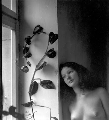
And, as you can see here, the image is a careful study of light, form and composition similar to the painted nudes of the late Renaissance artists and early Impressionists. One of the concepts I’m trying to get across to my students is that photography (and all art) is part of a larger conversation carried on by all who have practiced this craft in the past, those who are practicing it now, and those who will practice it in the future. I entered the conversation at Duke University in 1966 when I took my first Art History class. I continued the conversation when my wife and I visited nearly every major cathedral and ever major museum in Europe during the early 70s. And I continue that conversation today as I talk to my students and my photojournalist son, Ben Weller, and as I seek out new photographers on the web such as the amazing work of Brazilian economist Sebastiao Salgado.

My nude mage is also useful as a classroom demonstration tool because it illustrates an effective use of light (with the only light being the sidelight through the window into an otherwise dark room), the light balance (contrast) is easily manipulated in photoshop. In the image below, I increased both the lightness and the contrast, a net effect which tends to darken the picture but gives the woman greater highlights on her skin while reducing the slight “muddiness” of the original version. What’s neat about having the darkroom set up, is that I can talk about how I could manipulate the picture with polycontrast filters, exposure times and dodging and burning - the students seem fascinated by the darkroom process.

For a PPT version that shows with the click of a mouse the differences between the original version and the Photoshopped version, click here.

And, of course, it doesn’t hurt that we can talk about this picture in terms of the “rule of three” – the image has just three major components: the woman, the window and plant, and the dark interior of the room above and behind her. These three elements are carefully placed and balanced in this picture.

Thursday, February 07, 2008

Photoshop Ethics


This week my J210 class is continuing our discussion of “Photoshop Ethics.” We are maintaining this discussion in the context of who makes decisions about what is “true” and who determines what we think of certain issues, such as the “standards” for “beauty.” The two are closely intertwined, because with the advent of Photoshop , any discussion of “beauty” takes on a new, digital meaning (just take a look at the Dove Real Beauty Campaign, for instance). So, once again, the question becomes, who is setting the “standards,” and why?
In this limited space, I don’t want to go into a diatribe on advertising and on post-capitalism, I instead just want to point back, to the power of Photoshop. I chose this image (which I’ve already used in its original version in a blog post much further down) because it sets the tone for any discussion on the relation between advertising capitalism and body image and “beauty.” I’ve always liked the mage, a street scene in New York City near Chelsea Market, because of its composition and subtle multiple messages. But it wasn’t’ a sunny day, and the original image as picked up on my digital camera was not particularly “snappy.” Enter Photoshop.
So, the question becomes, am I “cheating” because I enhanced the image to make it more closely match what I had in mind when I framed it? I think the consensus I’m hearing is that when it is art, the photographer is in charge; but when it is journalism, the rules are more fixed.
 
For another take, with examples, on this issue follow this link: http://www.mediabistro.com/10000words/10-news-photos-that-took-photoshop-too_b328